2026 / Civic health app
Eagle Care: a citizen app that works harder
Redesign of Eagle Care's citizen app home, menu, and notifications, turning a reactive experience into a surface for care, guidance, and public communication.

This case started from a simple question: what happens when the home screen of a municipal health app stops being a greeting and starts working for the citizen?
The previous Eagle Care experience supported important functions, but behaved like a quiet entry point. People opened the app, looked for a specific task, and left. For a platform connecting citizens to health services, appointments, medication, public information, and support, that pattern revealed a larger opportunity: turn the first screen into a surface of value.
The starting point
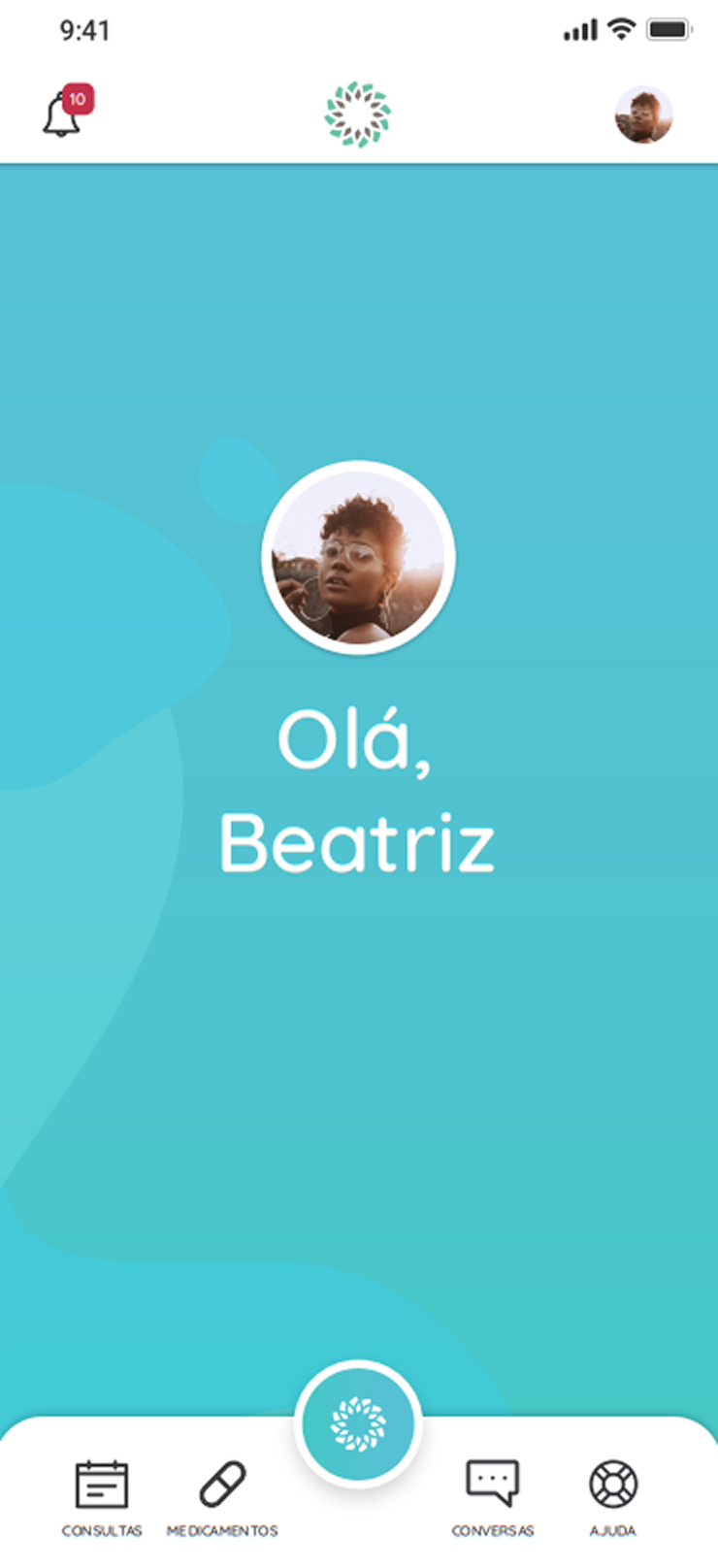
The old home screen concentrated attention on a visual greeting. It created brand presence, but did not answer the questions someone is most likely to bring into a health app: do I have an upcoming appointment? is there medication to remember? is there an important message from the municipality?
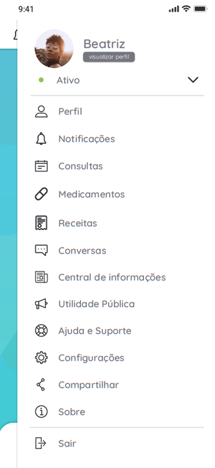
The menu carried the same interaction cost. Features appeared as a linear list, with many items competing at the same level. There was no grouping by intent, which increased search time and made navigation depend more on reading than recognition.
From start screen to useful summary
The new home was designed as a summary dashboard. Instead of relying on the user to search for everything, the interface brings the most relevant signals to the surface: upcoming appointment, medication reminders, health shortcuts, and municipal publications.
That decision changes the nature of the experience. The app stops being just a tool that reacts to search and becomes a point of follow-up. For citizens, this reduces clicks and improves the sense of control. For public management, it creates a more visible channel for campaigns, alerts, and guidance.

Menu as map, not inventory
The menu was restructured to reduce reading and speed up decisions. The long list became a grid with larger touch targets, more recognizable icons, and logical grouping across health actions, personal information, and support.
This change is not only visual. In apps used by broad public audiences, architecture needs to support quick recognition, tolerate low digital familiarity, and work well one-handed. The grid helps turn a list of resources into a map of intentions.

Notifications that become action
The notification center was treated as a decision layer, not just a message inbox. The goal was to reduce context switching: confirming an appointment, registering medication intake, or understanding an alert should happen inside the notification flow itself.
This pattern brings communication and task closer together. A message stops being a loose alert and starts carrying the most likely next step. In healthcare, that detail matters: every removed click reduces the chance of forgetting, dropping off, or misinterpreting information.

Empty states are part of care
The work also covered moments with no data and error states. Instead of leaving blank screens or technical messages, empty states were designed to explain the situation, keep the user oriented, and offer a clear way forward.
This layer is small on the surface, but important in the product. It prevents people from reading absence of information as failure, reduces frustration, and preserves trust in the system.


What this project shows
The value of the redesign is in the product's change of posture. The interface stops waiting for citizens to discover where everything lives and starts organizing priority, context, and action.
For potential clients, this case shows a process that starts with a critical reading of the existing product, moves through information architecture, and ends in interfaces prepared for real use. The visual delivery matters, but it does not stand alone: each screen answers an identified friction.
The proposed validation metrics would be direct: lower home-screen drop-off, more interaction with municipal publications, less time needed to find menu features, and higher completion rates for actions triggered by notifications. The goal was not to add more screens, but to make each screen work harder.